One of the hallmarks of science is the ability of others to repeat experiments. Not to create consensus for it's own sake or for force of argument, but rather to ensure that experiments are done correctly. With this in mind, I thought it would be interesting to look at temperature data recorded in my neighborhood, that is used in calculating global temperature means.
Example 1, Banff Station| 51.2 N | 115.6 W | 403711220000 | rural area | 1888 - 2009 |
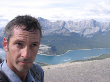
(I went to this exact spot)

Here is the official temperature data. Under NASA GISS protocols, this station is considered a rural station because it contains less than 10,000 people. Technically correct when the station began recording, Banff was a sleepy village visited by intrepid train travelers. Over the course of the century, the ski hills opened, the Trans-Canada highway opened and the town began to attract year-round visitors. The international airport in Calgary opened and funneled international tourists into the town as well. What started as horseback traffic at the turn of the century grew into 5 million visitors a year.
I don't know what the heat signature is from 5 million people. I can only imagine that 25 Saskatoons, in a small valley like Banff, generates heat. Whether it's hotel air conditioners or thousands and thousands of RVs generating and reflecting heat, or millions of automobiles racing around on new 4-lane superhighways and interchanges, the heat signature around the recorder is totally different than it was at the turn of the century. Is it possible to factor these changes out? There may be generalized computer models whose accuracy is determined by how well we understand all the variables. Since this knowledge is still imperfect, the models are highly suspect. Certainly no one has made even an attempt to "correct" the data for this particular micro-climate at this particular recording station (and currently, this may not even be possible.) It seems to me that there are enough questions regarding changing the environment of the data recorder to rule out constructing a temperature trend from this data. Despite the obvious problems, this station forms part of the global temperature data.
Example 2 Calgary INTL station| 51.1 N | 114.0 W | 403718770000 | 593,000 | 1881 - 1990 |

If you look at this data, you will see an increase that begins around 1970. Savy Calgary residents can easily tell from this graph when the OPEC crisis happened! Thats when oil prices soared and Calgary's urban development boomed. A picture is worth a thousand words so below is a before and after of Calgary in 1969 and later in the year 2000.

Pictured above is Calgary in 1969 before massive city expansion.

Pictured above is Calgary in 2000. Note the heat sink now called the downtown core that has enveloped the Calgary Tower. For a top down view see the picture below. I've coloured in the city expansion in the last 40 years in blue. Notice how not only did the core become a massive heat sink, but the location of the data recorder became completely surrounded by development. I placed the location of the data recorder myself but with the coordinates given and Google Earth, you can easily do it yourself.

With what you have seen, it seems pretty obvious that separating increased heat from the local environment is very difficult indeed. Clearly the post 1970 temperature increase in the Calgary data is an effect of urban development. But how much? Some non- zero amount that is closer to 100 percent than zero percent.
As in the first example, it seems hard to believe, but this data is part of the data set that is used to declare that the global temperature is increasing.
I use these examples not because they are the two bad apples of climate data, but because they are the climate recorders who's local environments I can verify for myself. In fact there are many really bad data recording stations out there whose data has been compromised by local building regardless of whether they are considered urban or rural stations. For a collection of really bad stations and further links to a project to visit all the weather stations to investigate local conditions that may affect climate data, see
here.
 This week Calgary was buried in snow causing major transportation problems. The drifts in some areas were chest deep for several days as they waited for city crews to clean them. It was lucky that no emergency services were required in those areas since neither ambulance nor fire trucks would have been able to penetrate the massive drifts.


